Last year, we approached a group of disaster communication experts at the 2016 CAP Implementation Workshop in Bangkok, about 60 people with a profession related to disaster management. We wanted to know how they think about pictograph based communication, what their ideas are, and how they understand pictographs in their own field of expertise.


Within one workshop session, we made an experiment with the participants. We provided them with either a disaster alert as issued by agencies (e.g., “We have recorded 77 millimeters of rain over the past 24 hours in your area. LANDSLIDES are likely (more than 50% possibility) to occur in the hilly regions. People in those vulnerable areas are advised to take precautionary measures.”) or an incident report given by affected people (e.g., “I see a LANDSLIDE in the area I am in. It has damaged the road, electric poles, and a bridge. There are 7-10 people injured and need immediate medical assistance.”). Those texts were randomly distributed and then each participant was asked to draw a pictographic representation. In a second round, everybody exchanged their drawing with a colleague to then ask the colleague to interpret it. We wanted to find out: What would experts include in their pictographic drawing? And how well could they understand their own representations, given their professional background? In this blog post, we cannot cover everything that we learned from this session, but we want to share some of the most interesting insights taken from this study.
Numbers? What numbers? People in agencies usually love numbers, and disaster alerts are often full of numbers (e.g., denoting rain intensity, see above), so the example alerts contained a few of them to see how the professionals would translate them to pictographs. What turned out was: they don’t. Almost all drawn alerts omitted them completely, so it is obviously not trivial to include them. We found that times and time spans were represented, mainly using clocks, other measures were, if at all, used to adapt the drawings (e.g., used to determine how high the water should be drawn).


Reference objects and qualitative measures We know that it is a good strategy to rely on reference objects to indicate quantities and amounts, and it worked out really well in our exercises. People used predominantly houses, but also cars to indicate, for example, flood heights. The interpretation, however, could differ quite a lot. A similar flood height drawn in relation to a house would result in “severe flooding” (left) or “moderate flooding” (right). But then, what would mean these terms to people affected? In the end, it’s more important for them to know what they should do instead of knowing how the situation is called, so instruction is an important aspect to focus on.
Instructions – important, but difficult While people were quite successful in depicting the hazard (e.g., the landslide), it was much harder to draw the instruction part. Often, this was omitted, and if they tried to find a graphical representation for it, sometimes misinterpreted. In particular, it often stayed unclear what was part of the threat description and what was part of the instructions. Both must be clearly distinguishable to avoid the confusion we found in the experiment.
Arrows in time sequences and directions A graphical symbol frequently used was the arrow. Arrows were used in two different semantics:
- To show directions and dynamics: arrows indicate movement, e.g., land masses sliding downhill, or directions within instructions (e.g., where people should evacuate). This straightforward meaning was easy to understand.
- To indicate time sequences, as in step-by-step instructions: First do this, then do that. This was always well understood, and we found arrows to be the only element that was successfully used to encode such step-by-step semantics.
Overall, arrows showed to be a very accessible element for the given purpose – as long as it was clear whether they belonged to instructions or alert (see paragraph above).


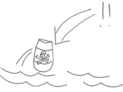
The obvious is not obvious People were asked to draw a toxic spillage alert that pollutes a river, and the signage everybody was using was a barrel with a skull with crossed bones on it near some water. This was perfectly understood by the interpreters (left, e.g.), with one exception that understood “Help, Pirates” (right). In a different context, a skull and water would perfectly indicate this, and thus even experts can dramatically misinterpret obviously clear pictographs. This clearly shows how context-dependent pictographs can be, and how large the misconception can become.
Some remark at the end: Some might wonder why we approached disaster management professionals first, and not the targeted user groups. But if we take into account that all communication has a sender and a receiver, and both must agree on a common protocol to be able to understand each other. We need to understand both sender’s and receiver’s needs and backgrounds to be able to enable successful communication, so that is why, in our opinion, it is necessary to also investigate the professionals. Only if it is clear what is being talked about and how, we can provide means to help communication with all kinds of audiences.
The “Mobile Pictographs for Disaster Communication” project is supported by Elrha’s Humanitarian Innovation Fund.
Leave a Reply